To save you time researching on this, here are 8 tips you can apply to improve your checkout conversion rate. Let’s take a look.
1. Allow guest checkout
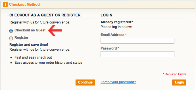 Sign-up forms are barriers to online purchase. It discourages customers from going further down the buying funnel. In fact, according to an Econsultancy survey, forced registration causes 1 in 4 customers to abandon their purchases.
Don’t force customers to create an account before they can buy your product. Make it an option. You can provide both sign-in and guest checkout options on the checkout page. Most people will choose guest checkout for its convenience.
But, you can always ask for registration later on your thank-you page when customers have done with the checkout.
2. Display trust elements
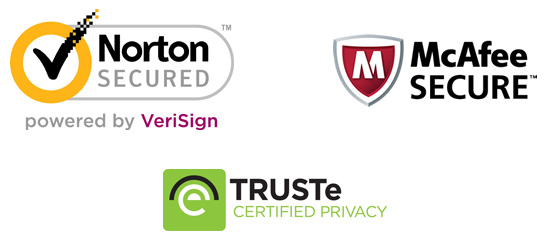 Checkout is a sensitive phase in the whole buying process. Customers need extra assurance before putting in their credit card information and hitting “proceed”. To eliminate doubts and increase customer confidence, trust elements should be employed.
Trust elements may include security seals, money back guarantee, 100% satisfaction guarantee, social proof and so on. These guarantees should be made prominent not only on the checkout page, but also throughout the site. That way, you can build trust from the first impression.
3. Keep your form lean
Redundancy or unnecessary steps can easily tire your customers out. Don’t make filling in your checkout form a painful task with a long list of required fields. You may want to collect as many customer information as possible to satisfy your database growth. But don’t ever risk losing a potential sale like that.
You can test your form fields with a group of beta customers to make sure which field is essential, which field is superfluous. Moreover, if you go the extra mile to personalize the checkout form for each customer, you can boost their satisfaction and they will be less likely to abandon their cart.
4. Make coupons less prominent
 When people see that “Fill in your coupon code” box on your checkout page, they may leave the site to search for coupons (if they don’t have one). If they find some, you can breathe out in relief that they will come back and finish their purchase. But if they don’t, there’s a high chance that you’re going to have a cart abandonment.
Rather than showing a full coupon/discount box, you can add a hypertext like “Got a coupon?” that expands into a full box when people click on it. That way, your discount box will appear less prominent for those customers who don’t have a coupon code and they will find it less itchy to go look for one.
5. Save cart details
During the checkout process, customers may click on the wrong links or button by accident and get navigated away from their current checkout page. What do you think they would expect when coming back? Not an empty shopping cart, obviously. But a cart content which is just like how they leave it.
Technical mishaps happen all the time, so make sure your customers are able to pick up from where they left off. Their checkout form should be saved so that they don’t have to refill it. You can then save them a lot of time and frustration.
6. Add a progress bar
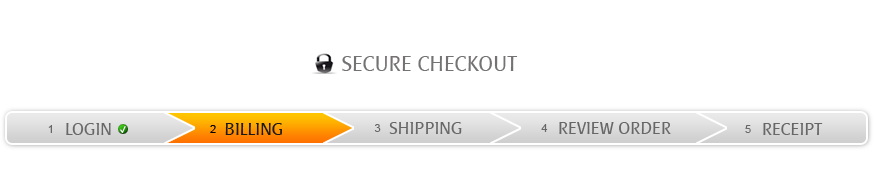 Confusion may occur during the checkout. When customers have to jump back and forth between many pages, it’s easy for them to have the feeling of getting lost in the multi-step process.
A progress bar, therefore, should be used to let customers know which stage they are currently in when doing the checkout (shipping, payment or order confirmation stage, etc.). It makes your whole process look more transparent and helps customers visualize their progress better.
7. Add “Continue to shopping” button
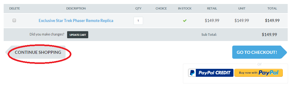 When checking out, customers may have the need to come back and add more items to their cart. They either forget it from the first place or decide to buy more after seeing your upsell/cross-sell suggestions.
Some tend to just click on the “back” button and risk the chance of their process getting disrupted. Therefore, you should give them the option to safely come back and continue shopping without worrying about their cart getting lost. In this case, a prominent “Continue to shopping” button will do the trick.
8. Provide real-time support
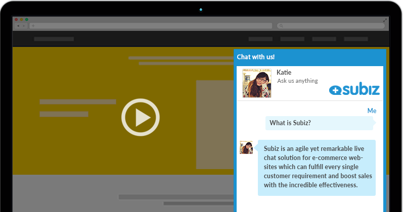 Customers can encounter a lot of problems when doing the checkout. It could be either their payment can’t go through, the shopping cart doesn’t work, the checkout page doesn’t respond or the coupon box doesn’t display correctly, etc.
Besides those technical mishaps, customers may have many doubts when it comes to spending their hard-earned money. They may doubt your shipping method, money payback policy, or quality guarantee, etc.
That’s why real-time support like live chat will help them feel more confident with their online purchases. A human chat agent is right behind the chat window, ready to tend to customer’s issues instantly without making them wait in any long line. Customers will then be more willing to continue their checkout process.
What’s your take on these 8 tips? Do you have other ideas to improve checkout conversion rate? Comment and share with us. We would love to hear from you.