Fortunately, it is not difficult to advance your content as long as you understand how typography affects your targeted customers.
To a Newbie, What is Typography?
Typography is a sector of design to arrange written words into a visual appealing way with specific purposes.
A text is a group of one or many words. The text remains unchanged no matter how it renders. I can write down “I love Subiz” in a document, say it out loud or save it in a file on my pc. It’ll be exactly the same words but rendered in different ways, visually, vocally or digitally.
However, when I decide to make the text visually displayed to other people on a paper, a screen or a board, typography officially involves and transforms my text into varied appearances in regard with my targets.
As you can notice from 2 banners below, the combinations of typeface, text format and layout catch your attention first and then bring you different emotions and message later. That’s the principal of typography.
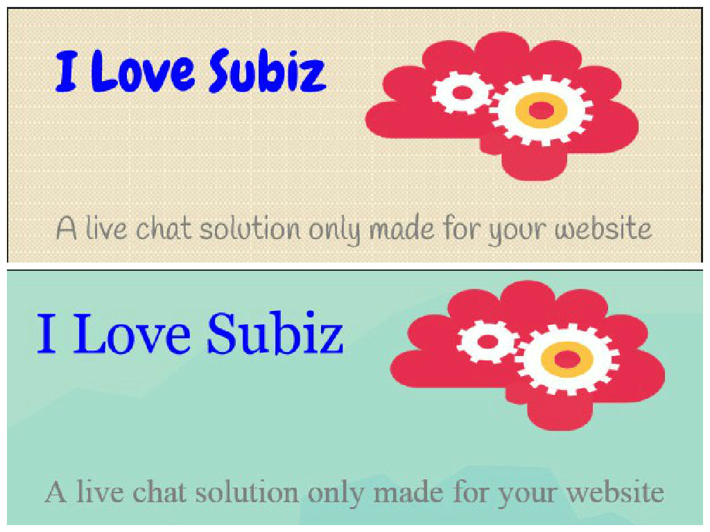
Are they different?
Key Insights about Typography
Let’s clue up how this technique influences your reader.
- Typography affects perception
According to an experiment conducted by Error Morris on The New York Times with roughly 40,000 responders answering a quiz.The result revealed that even a small difference between similar fonts could lead to a big effect on the credibility of written text.
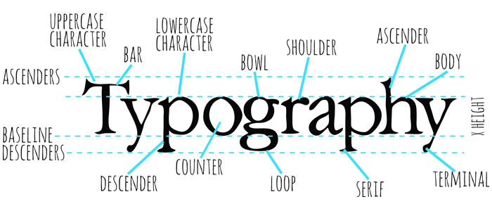
Effect of typography
In details, participants were more likely to agree with statements presented in Baskerville while Comic Sans turned out to inspire the most disagreements from those people when used in the quiz. Consequently, Comic Sans is supposedly to be the font that people love to hate and suggested not to use in business except comic book industry.
- Font size does matter
Typography is not only about the fonts, but they do play an important role in the content marketing inspiration especially in the digital age. It’s so obvious that you won’t attract any customer’s interest if the font of your brand is boring or unpolished.
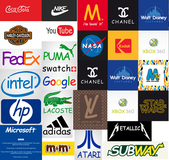
Famous brands ain’t lovin’ anymore when they are in Comic Sans
Usually a fun and creative typeface will draw reader’s attention and interest. However, staying with traditional and appropriate one is necessary in some specific cases. Otherwise, you might face the risk of losing your customers.
So which type of font is safe in use?
Michael Bernard of Usability News conducted a study with 60 participants to clarify whether font size matters. The study compared 8 online well-known typefaces which were analyzed at 10, 12 and 14 point sizes. As a result, the most preferred fonts at 10, 12 and 14 point size were Verdana, Arial and Comic Sans respectively. Referring to legitimacy, Tahoma was the best at 10 point size, Courier at 12 and Arial at 14.
How people read
Apparently we don’t read in a continuous flow. Our eyes carry a chain of back and forth movements called saccades on the line of words and shortly pause at some points called fixations.

Fixation and Saccade
The length of saccade hops depends on reading proficiency and topic familiarity of readers. And during a single fixation, only a handful of characters around the point are seen clearly while the further ones become blurry.
If the readers miss something across the text and have to jump back to reread it or simply don’t understand the content, it will result in reducing comprehension or even worse that they stop reading. This is absolutely what you don’t want to happen with your marketing campaign.
To speed customers up in reading your messages, there are some No-No things that you shouldn’t do when you typo your text:
- Use a lot of foreign words and information
- Put the whole passage into capital letters
- Use Underling, Bold and Italic regularly for emphasis
- Cite long quotation
As Zuzana Licko, a type designer, said “Readers read best what they read most”. Trying to create your text with recognized letters and common words is one of the useful ways to build up a user-friendly design. This will consequently help to market your brand and commute with your customers effectively.
Serif vs. San Serif debate
Another interesting fact about typography is that using san serif typeface in online reading is better supported than serif. A serif typeface contains small line added to the standard form of a letter or symbol. In contrast, a san serif typeface has no line or tail attached to its embellishment like the opponent.
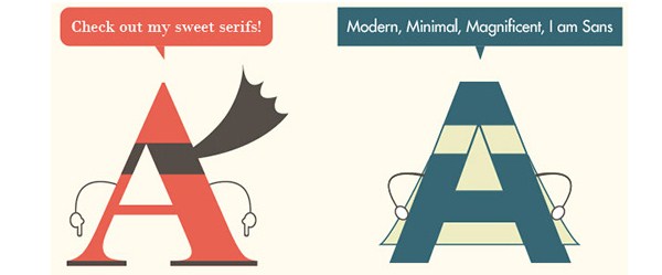
Serif vs. San Serif debate
It is commonly acknowledged that san serif font is more readable on screen because of its simplicity will survive reproduction and smearing. Meanwhile, serif font is used to enhance differentiation and gap between various letters as well as identification.
Therefore, serifs are recommended for the title and subtitles while san serifs are more suitable for the body part of your copy.
In a Nutshell
Typography is no doubt one of the main techniques to draw your customer’s eyes and it requires more of your skills than your own taste. A good typography can optimize e-marketer’s message, trigger the right emotion from readers, which can lead to the right actions that the marketer desires.
If content is a model, then typography is loads of make-up and Photoshop put on her appearance to make her more appealing and impressive. Without content, typography is no more than a tool of art or design. And without typography, the content is still itself, but sadly loses its attraction and power in catching the eye and mind of clients.
Therefore, they must go together as a whole package to produce a perfect representative of the brand. Hand in hand, they will rule the world of digital marketing.

