However, does showing up everywhere customers go mean anything good? How much of “eagerness” via live chat invitation should you show on your website? Let’s examine all the possibilities and find out the best lead-generating places for live chat invitation.
Home page

Although homepage isn’t really where you gain the sales, it is one of the places where live chat trigger should appear. Having visitors to land on your e-commerce homepage, you’ve been successful in catching their interest. Now it’s time for first impression! Remember that you only have a very short span of time to take things further with potential customers, especially if they’re first-time visitors (people normally don’t spend more than 15 seconds on a website – researches say).
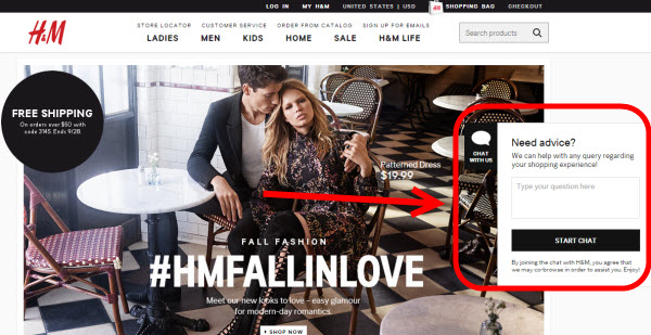
More importantly, support and contact information are always important elements of an e-commerce website which need to be shown directly on homepage, not buried in countless clicks and tabs. If you’re a frequent online shopper, you’ll see that many online shops’ websites welcome you with an impressive design AND a chat invitation.
Why so? Let’s say I’m impressed immediately by a shockingly low price in a smash sale deal via the top banner on the homepage of your website – you can then catch me with a warm, conversion-optimized welcome via live chat trigger. If I’m not going to accept the chat invitation, at least I’m pleased that I’m noticed and greeted so warmly – that’ll be what keeps me exploring you website.
So, the homepage is quite important in gaining more leads for you. Your job now is to impress visitors by a finely optimized chat trigger as well as well-customized chat window that is in sync with the whole website’s design (if you’re wondering about which tool can help you with this task, why not try Subiz live chat and see how it helps you nail this?).
Pricing page/product page
Needless to say, product page or pricing page is among the most important pages for a chat invitation. Before people place an order on your online store, you’ll want to put more confidence in them so they’ll finish the purchase without leaving the cart empty, right?
Do that with a chat invitation! By a good will of helping customers right from these pages, your company is more likely to impact potential customers’ shopping confidence because they can rest assured that you’re always here to help.
Judging things from psychology, 42% of customers will abandon their shopping cart due to the lack of necessary information. Now that you learn this number, don’t let it happen. Apply a live chat invitation to help customers feel more confident to click “Buy now” button.
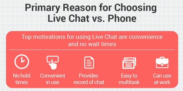
More than that, live chat supports you with the quickest and most direct way to deal with customer’s issues. You can customize a chat invitation to suggest which colors or which clothing size would fit them, or just simply explain how that person can buy without registering for an account, etc.
Support page
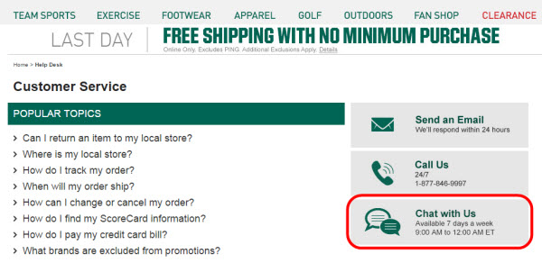
If you are seeking for a long-term relationship with customers, make sure you have live chat as one of the main support channels on your website. Here is why:
 Live chat lends you a helpful hand in building and growing a happy relationship with customers. Make sure that when people click on Support page, they’ll find live chat invitation there. People fire-sure don’t want to waste their time on any problems with your website or their purchase, so offer them a live chat option to contact when they are in trouble.
Don’t just limit live chat for potential customers. Save space for already-bought customers too. Note that you’ll have to set up clear categories of pre-chat options so these kinds of customers will be redirected to the right agent (they’re not going to ask pre-sales question, don’t you agree with me?).

You won over customers with making them buy. Now win their heart to make them stay!
Bonus: the no-no
Don’t bombard your website’s visitors with chat windows everywhere they go. It will be worse if it’s a pop-up or floating chat invitation. If you do this then congratulate! You’re already in many people’s blacklist (maybe mine too). Live chat is a great way to tell your story and support customers, just don’t overuse it.
Additionally, don’t waste your time with pages like About us or Blog page. It’s even ridiculous to put chat invitation on these pages.
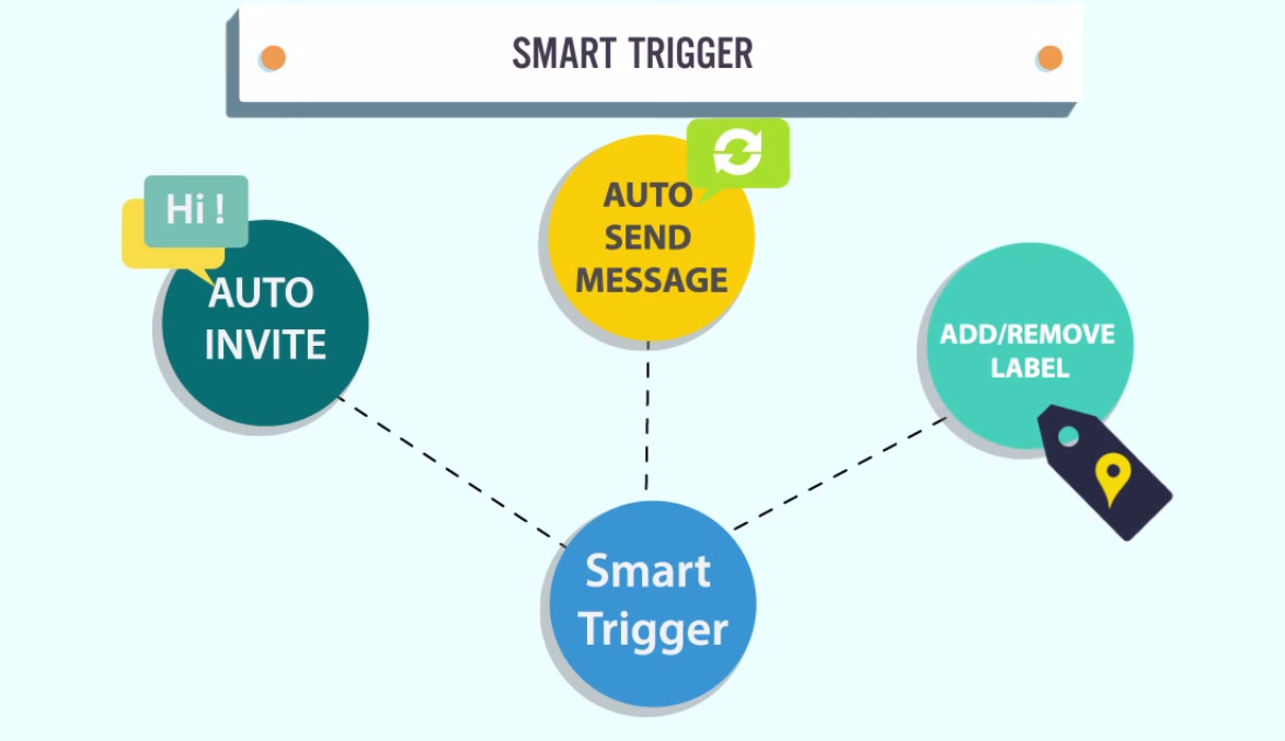
One last thing is don’t forget to test out all the possibilities of when and where to invite people to chat. For example, if a person is hanging on too long at checkout page, you can set time for a chat popup to jump out after 15 seconds. You’ll need to take much experiment as well as testing before knowing what really works for your website. Don’t blindly follow any tips and waste your time on the unsuitable ones.
Wrapping up
Like any other elements in user experience and website design, where to put your live chat invitation is a matter of understanding the context. There is no absolute answer of the best place to show a “Have a question? Ask us!” sign on your website. Consider the possibilities listed above and you’ll find the best places that work for your e-commerce website.
Where have you put live chat trigger on your website? Let’s share!


