Landing page is designed to serve various objectives but they all target to a primary goal of online marketing that is to create and increase conversion.
Tools to make landing page are many, however not everyone knows how to make a great one which guides your page visitors to act as you intended. Let walk with me through several tips to get some ideas to create your awesome landing page.
Stage 1 – Before the Make of Your Landing Page
1. What is your purpose?
You need to determine what you expect your visitors to respond on your landing page. It can be downloading a free e-book, subscribing newsletter, receiving coupon or filling up a form. Be clear about your goal is the first step to start your work and make it well done.
2. Who is your audience?
Knowing your audiences not only means identify their basic information like sex, age group and occupation but also understand their dream, concern and expectation. Therefore, you can care about their need better and be the first one to provide what they want before they even have to ask or search for it.
3. How did people land on your page?
Tailoring your landing page content to fit the audiences based on where they come from is important in online marketing. Where includes geographic location and digital sites for example Google search result, social media pages and commercial email.
The tip is to categorize visitors into as specific as possible groups and show them the landing page that matches their references most. In case you have limited resource for this job, just do the best as you can by designing at least one landing page for each online campaign that you are running.
Stage 2 – Notices While Designing Your Landing Page
1. Make your page run like the wind
I can say that online customers are the least impatient people especially when they have to wait for the page to load. You better speed up your page or you lose your money because sadly every second delays in loading time will lead to 7% loss in conversions.
2. Talk to your visitor
Using “you” in your landing page message to communicate with your audiences will make them feel like you are interacting with them personally. Also present your content with the local language and culture of your targeted market can gain more trust and add value to your business in local customer’s eyes.
3. Keep your content short but sweet
You get 15 seconds of attention from a reader on average. In other words, you have a quarter of minute to convince the visitors that your page is worth to stay longer and able to provide what they are looking for. So your landing page text needs to be concise and interesting.
Many e-marketers use bullet points to make the text more comprehensive meanwhile some prefer using images for non-verbal communication.
4. Trust enhancement
A smiling face will work in order to increase trust from your audiences as it implies your team’s happiness and engagement. Picture of woman brings connection and stress relief while picture of man results in acceptance and affirmation.

Other popular ways are to embed trust testimonials into your landing page, cite quotes from real customers and display security elements.
Enhancing trust is also helpful at avoiding online shopping cart abandonment which is essentially vital to any e-commerce business.
5. Show the audiences their benefit
“What does it have for me?” is probably the most common concern of people while looking at a landing page. So instead of talking about your business or your achievement, you better go straight to the offer and show the audiences what they can benefit from your page.
If you would like to ask for more information, remember to reduce your requirements as much as possible and give the visitors the most flexibility with least obligation. Make your visitors feel like this is just a one night stand and possibly develops to something more serious if everything goes well but absolutely not an arranged marriage against their will.
6. Call to action
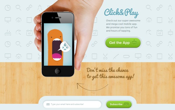
If people can see their benefit in your offer showing on the landing page, they will act as you expected. Then, make sure your call to action button appears prominently and not require people to scroll down the page for it. Y
ou can apply contrasting colors to make it more eye-catching and keep it short as well as use action-stimulated words for instance get, shop, try, book and free.
7. Social sharing buttons
Don’t forget to add social buttons for your visitors to show their like and share your offer to others. Word-of-mouth marketing is never old-fashioned and always an effective way to market your business. Also it’s free.
8. Eliminate distracting factors
Your landing page will be a fail if it contains some distracting elements that navigate the visitors away before accomplishing the page’s objective. You have no one to blame on except yourself if you give them the chance or reason to do that by providing additional link or information leading to other pages of your website.
Be patient and save what you want to show later on a thank-you or follow-up page which will appear after they seal the deal on your initial landing page. In that way, you can rescue your conversions and increase after-deal engagement with your customers.
Stage 3 – Final Steps before Launching
1. Conduct A/B testing
A/B testing is required to ensure that you are using the best version of your landing page for conversion optimization. By applying split testing, you will get valuable insights, fix the problems and eventually advance your page to increase the possibility of transforming a visitor into your customer.
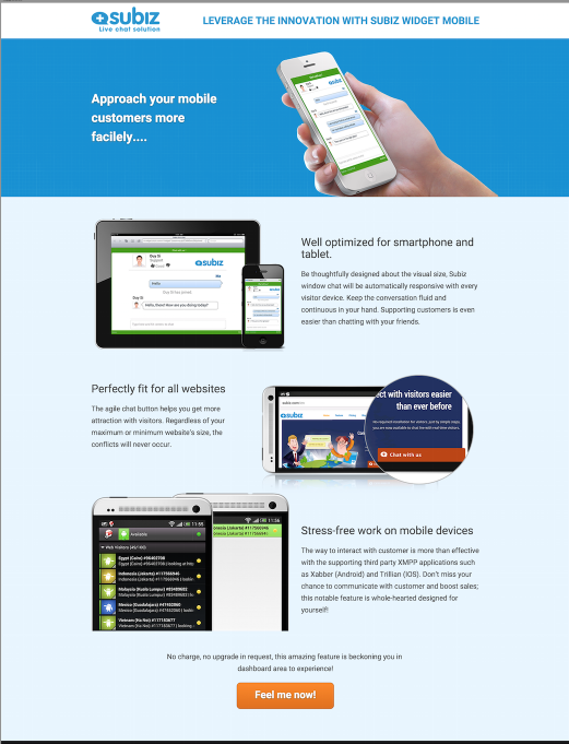
2. Make your page mobile friendly
Last but not least important step to make sure your customer have a fully satisfied online marketing experience on your landing page no matter which device they are using.
Do you use landing page on your website? How do you optimize landing page for conversion? Let share with us your tips.
