Optimize your mobile-friendly website to get a higher rank on Google search result
As we all know, the most important thing for an online business is the traffic. So, if your business depends upon online traffic, you should not ignore this news because a majority of digital traffic online now comes from mobile devices.
The new algorithm does not block or remove your site due to its low mobile-friendly score according to Google Webmaster Trends Analyst John Muller, but your mobile site will have lower Google ranking on search result when it competes with other optimized mobile websites, which leads to fewer sales to your business.
A quick way to determine whether your mobile website is friendly or not is to use Google’s Mobile-Friendly Test Tool. This tool will not only assess whether your page has a mobile-friendly design, but it also gives you some advice on where improvements can be made.
However, Google’s Mobile-Friendly Test Tool can only analyze a single page/URL at a time, so the best approach to a larger site is to connect to Google Webmaster Tool to check the status of your entire site through Mobile Usability report.

Check your mobile website to see whether it’s mobile-friendly or not
Just because your website can be viewed on a mobile device doesn’t mean that it is mobile-friendly. If you want to reach a higher position on search result and gain more sales, optimize your mobile website now to make it more friendly.
1. Simply your website design
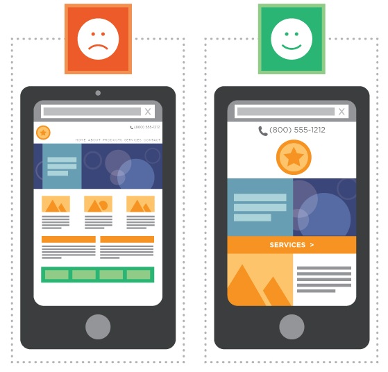
Browse your website on a smartphone to see how it appears and you’ll probably see the need for design changes. To display well on mobile, a page need to have a simple design with large font sizes, critical information placed “above the fold”, and big, touchable buttons that are easy to click.
Too many bells and whistles (i.e., graphics, copy, video) can hinder the site’s ability to load quickly. Customers on mobile devices are not patient as those on the desktop, so if your mobile website is too complicated and not easy to use, they will bounce before they can convert.
2. Be responsive
Responsive design is aimed at crafting sites to provide an optimal viewing experience – easy reading and navigation with a minimum of resizing, panning and scrolling.Responsive design is all about creating a homogeneous experience regardless of the browser or the device screen size.
According to Kevin Janosz, COO of RITTA, a marketing and advertising agency “Responsive is a more unified approach to Web development that allows you to create a similar experience for the user no matter how they are accessing the site (desktop, tablet or smartphone).
3. Don’t forge the mobile site’s speed
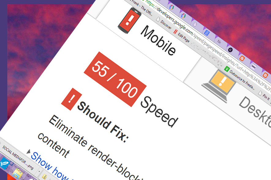
By testing mobile website speed on Google PageSpeed Insights, you will have the general look about the speed of your mobile site and how to improve it if necessary.

Make your mobile website faster if it’s too slow to load
Most of the users on mobile devices now use 3G while surfing the website, so it’s very essential to make your mobile site faster as much as possible.One way to do it is to serve images that are optimized for mobile.
Moreover, video is an absolute must-have for any mobile site. According to a research about user behavior, consumers using mobile devices are three times as likely to watch videos than laptop/desktop computer users.
So, your mobile video player should run HTML 5 to ensure that it can play on most mobile devices. In addition, a video play on your mobile site can help you improve significantly page loading time and provide a better overall experience.
4. Using icons instead of words

Using icons to keep your mobile website from looking cluttered
To keep your website from looking cluttered, don’t use too many words to tap to call, instead you should use icons.Make sure your symbols are large enough to touch with one finger. This is one of the most important tips for optimizing for your mobile website as you want users to be able to navigate your site easily without zooming.
If your customers have to pinch to zoom, it means that your mobile website is not optimized for that browsing device. Most users now visiting a website will be using a touchscreen device, so ensure that they can touch any call to action button on your mobile site easily, even for fat fingers.
5. Keep the content concise and meaningful
With a limited space on the mobile screen, don’t let your visitors scroll so many times to get all the information on your mobile site. Keep the content concise and only copy the meaningful text from the computer version to the mobile version.
6. Create content exclusively for mobile devices
You can use the same content for both computer visitors and mobile devices visitors. However, if you want your visitors easily convert on your mobile site, change your form. Too many unnecessary questions is not a good idea to convert your visitors to your customers.
Visitors are lazy to fill the form on a small device, then they will leave your site if it requires a lot of information. Your form should contain only some important questions.
In conclusion

Gain more sales with your mobile-friendly website now!
User experience is the most important thing for your online business, it not only affects to your sales, but it also makes your brand worse. By optimizing your site for mobile users and ensuring all mobile usability elements are satisfied, your site’s visitors will be more engaged since they enjoy a better on-page experience.
If your mobile website has too many problems and is not a mobile-friendly site, do not be hesitant to change your site now to get higher Google ranking in search result and gain more sales from your customers.


