1. New Desktop Widget
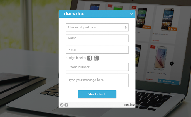
Subiz default widget for desktop now has been dressed in new, friendly and modern-looking blue. The color of agent name is also changed to match with the widget color. Besides, with this updated version, your visitors are able to use their Facebook or G+ account to log in to Subiz. They can simply type in their credentials and start chatting. What’s more, there is no need to login more than once since the user will be remembered.
Another notable thing is that all the configured elements will not be changed. We only change the elements that you have not customized (still as default) and add to your widget the brand new features.
2. New Mobile Widget
For mobile, our brand new widget brings you not only beautiful interface but also powerful experience.
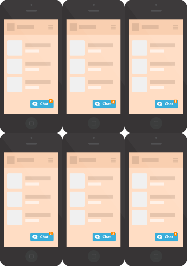
The chat button is smaller yet attractive
The new button is now perfect for mobile devices because it does not take up too much user mobile screen. It looks gorgeous on all websites, whether they are optimized for mobile or not. When your customers need supported, they can easily find you available via the attractive button which always follows them.

Small yet attractive chat button
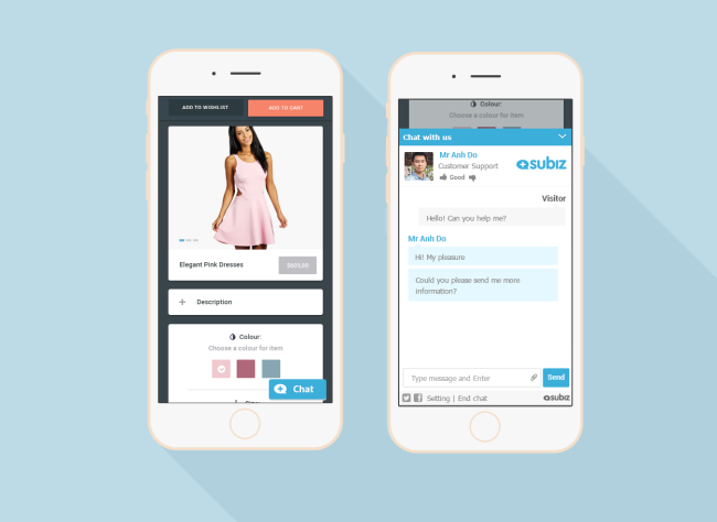
The widget is opened in the same tab
Clicking the chat button will open the conversation in a same tab. This makes it much simpler to browse a website and chat. And if you navigate away from the chat window, the conversation will remain active and can be easily resumed.
Flexible customization
You are able to customize CSS flexibly in order to align the chat button, hide the widget and change text color and font size.
That is all about our biggest change to the widget. We have a strong belief that it will help you increase customer engagements and rocket your sales ! So, do you like our new widget? Let us know in the comments section below.
Read more: Some notes for Subiz mobile widget


