This may go without saying, but are you positive you are doing it right? The rub is, it takes many clicks to finally make a sale. If you don’t get people hooked at the very second they land on your site, you fail.
Turning prospects into buyers is not a breeze. But before you rush to finding tactics to convert your potential customers, the real question is, are you nurturing any conversion killer on your site?
“Of course, not. Why would I do that!?” you may now be yelling. The thing is, you may be chasing your prospects away without even knowing it.
How? Check out these 7 signs below to see if your eCommerce site is accidentally pushing your prospects away or not.
1. Not engaging
One-way communication never works. You can’t expect visitors to automatically go straight to your checkout page seconds after their landing. They need some nudge to keep them going. And if your site is not engaging enough to make people stay and dig further, they’ll bounce off in just a click.
Being engaging is not so hard. Your store just needs to have a clear navigation and good usability. Use bold buttons and prominent call to action to guide people around. Display recommended items and most popular collection to keep them clicking. You should also try setting up a blog for visitors to interact with your brand. Every time they finish reading an article, use a subtle pop-up to encourage them subscribe to your mailing list or share the post via social network.
There are limitless ways to make your online store more interactive and the creativity is all yours.
2. Unsearchable

People are always on the go. They don’t have time to sit down and wade through at least ten of your pages to finally come across what they are searching for. They’ll come straight to the “store next door” which shows them similar items in just one click. Therefore, make sure your site is clutter-free and easy to browse with a smart search field or content filter.
Don’t forget to improve your menu as well. A well-coded menu helps to nestle loads of various products into well-organized categories for easier browsing. In case you are selling a service, adding an FAQ page to your site is crucial. It’s where people browse and raise questions to learn about your service. Let’s make it clean and easy to navigate as well.
3. Distracting

Pop-ups or ad banners may convert, but most of the time, they get a bad rap. People just hate intrusive advertisements. When they see it on TV, they switch channels. When they see it on a website, they turn it off. That is the best scenario. The worst is, they hit the close button and never visit the site again.
Lessen distractions draws prospects to your main content and helps to convert better. The distractions can be either in textual, visual or audio form. Don’t opt for background music if it’s not truly essential. There are times when I have to close a site merely seconds after opening it, just because I can’t seem to find the button to turn off their annoying music.
4. Not responsive

People are browsing your store not only on desktop or laptop but on mobile, smartphone, phablet and tablet as well. According to comScore, 4 out of 5 consumers use smartphones to shop. If your site is not mobile friendly, it’s frustrating for users to experience broken layout or missing text on those small and collapsed screens. And bad news is, a large number may end up leaving your site.
Going responsive mean your store’s layout can automatically adjust itself to any kind of screen sizes, so that the shopping experience would be almost the same between large and small-screened devices. The goal is to fully attend to a large amount of mobile users who can be your potential consumers.
5. Unappealing
Online shoppers have no way to see or touch your products directly. They can only rely on text and images to decide whether to buy or not. Therefore, don’t chase people away from your store with ugly screenshots and bad copywriting. Let’s make sure their shopping experience is as real and exciting as possible.
For instance, product images should be in high quality, zoomable and offer 360 degree view. Product headline, tag line and description should be enticing to grab people attention at the very first second.
6. Low speed
Human attention span is shorter than the attention span of a goldfish. If your site takes more than 5 seconds to load, no one would be around till then to wait for your content. They may run to your competitors instead and you may lose a good lead. So the motto here is, speed up now or wave goodbye to your potential buyers.
To tackle this, you need to test your site speed first. If it’s crawling at a snail’s pace, let’s run a full check-up to see which plugin or element is dragging your site down. Once you have pinpointed the culprit, let’s say a bloated plugin, just disable it or seek for a better alternative. Remember to always opt for a trusted developer to avoid buggy themes/plugins or other potential risks.
7. No help
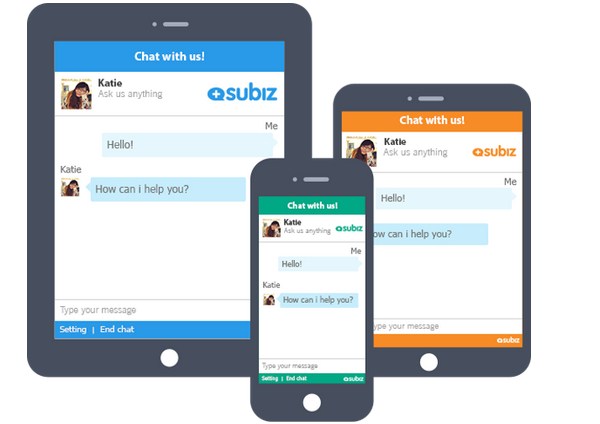
Real-time support is crucial in today’s online business, since people tend to click away when they can’t find help within minutes. Is your store experiencing sales lost due to a poor customer service? It’s time you considered employing a live chat solution for your eCommerce site.
Live chat tends to customer’s needs in a timely manner. Visitors can send queries directly to the qualified representative from the right department and get prompt replies in a few seconds. When doubts and misunderstandings are cleared up fast, it’s easier to avoid high bounce rate and nudge prospects into the buying funnel.
Does your eCommerce site show any of the 7 signs above? What have you done to tackle it? Do you have other thoughts on this list? Just comment and share with us.
