Check out these 8 common mistakes to avoid on your eCommerce site and your path to online success will be much less tough.
1. Poor design
Having an unappealing website is the equivalent of having no website at all. It drives visitors away and leaves bad impression. So in some case, it may be worse than having no website at all.
If you want your shoppers to take out their credit cards, your store has to catch their eyes first. Not only appealing to the eyes, the store’s look and feel must fit and resonate with your product industry. A store selling kid toys should be colorful and playful while store for luxury furniture should look elegant and classy.
2. Not mobile friendly

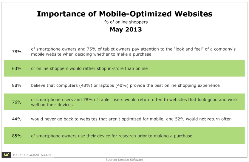
People are shopping not only on their laptop or desktop but on mobile, tablet and other collapsed-screen devices as well. In fact, 4 out of 5 consumers are mobile shoppers, according to a study by comScore.
Stats also indicate, 78% of mobile shoppers claim that the design of a company’s mobile site has a huge impact on their buying decision.
If your website corrupts or looks bad on mobile devices, you sure are going to lose a good amount of potential customers. You can either build another mobile site or make your current site responsive to most screen sizes.
3. Low-quality product images
Unlike those bland corporate sites which can look boring and sometimes sloppy, your eCommerce site must fulfill its responsibility of converting visitors into buyers. The visuals on your store, therefore, are incredibly important.
Don’t hurt your shoppers’ eyeballs with blurred and low-resolution product images. No matter how competent your product is, if it doesn’t look good, people will be less likely to buy.
Besides showing your product images in high resolution, you should allow your customers to rotate or zoom in the product for better inspection.
4. Lack of live chat
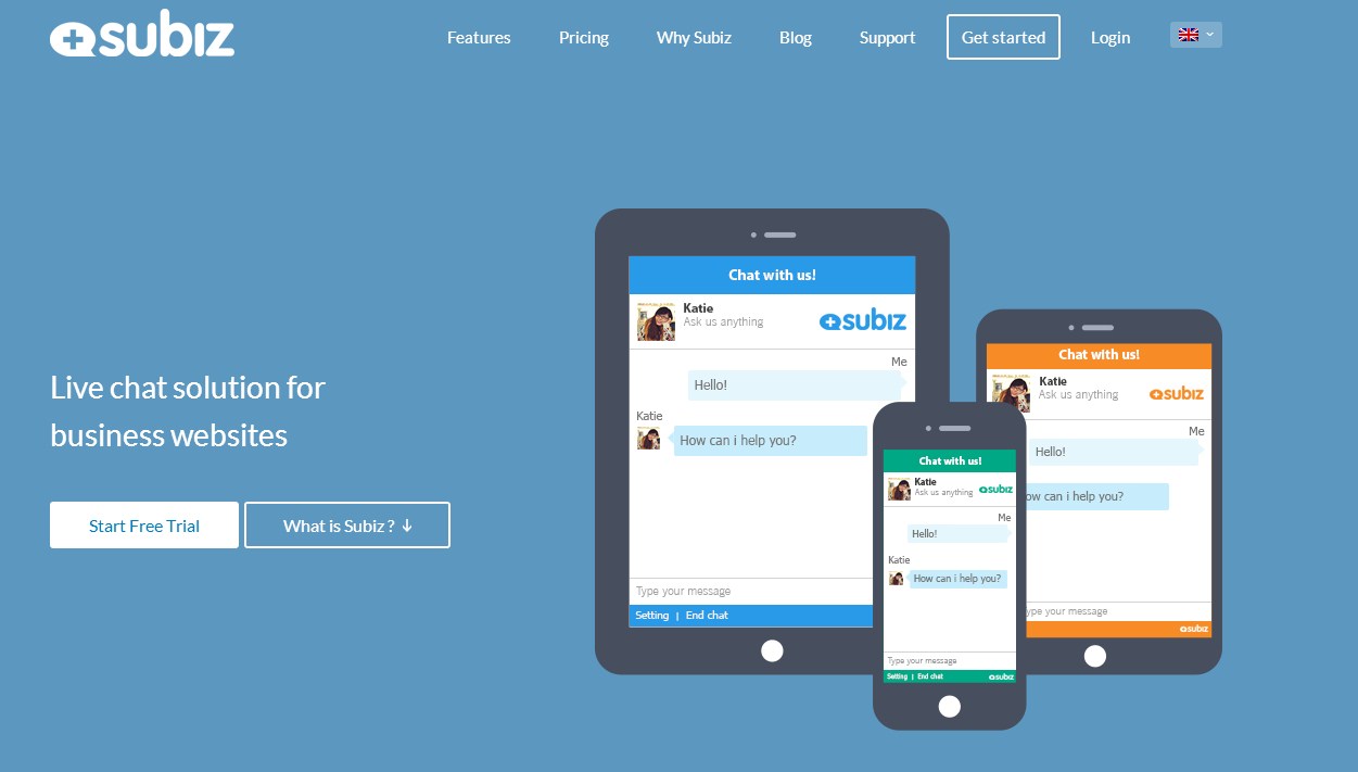
 Your business can’t get very far without great customer support. Aside from traditional channels like phone and email, your eCommerce business needs another competent support channel like live chat to leverage your online customer service.
Live chat support works in real time and assures customers of promptness and accuracy in responses. Not only improve customer service, live chat also acts as a great tool to reduce bounce rate, increase conversion rate, boost sales and many more.
Here are 7 benefits of live chat support for eCommerce websites that you should know.
5. Stock product descriptions
It’s easy to just copy and paste from the manufacturer’s descriptions, but this will hurt your conversion rate. If you want to stand out and make your visitors stay, don’t write boring product descriptions. Make it compelling and unique so that it can catch every shopper’s attention and pique their interest.
Rather than listing product specs/features, a good product description focuses on the benefits customers can get from the purchase. It should also create a sense of urgency to nudge visitors into the buying funnel.
Want to stop making stock product descriptions? Read more at this blog post: How to Write Compelling Product Descriptions That Sell.
6. Confusing navigation
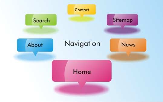
 Good usability is good business. Don’t harm your revenue with bad website navigation. No customers want a browsing experience with hiccups. They want a clear and intuitive web structure in which they can know exactly where to look for things.
To guide people through many buying phases, you should use bold buttons and prominent call to action to tell your customers what they need to do. It’s best to also improve your product category hierarchy and site search engine for better searching purpose.
7. Lack of guarantee
People are extremely cautious when it comes to shopping online. They have no ways to see or experience your product directly. They only have those product descriptions, images, video, reviews, comments, rating, etc. to aid their buying decision. If you want people to buy from you, you have to make them trust you first.
There are a lot of powerful guarantee techniques for you to gain trust. On your eCommerce site, you can show some security seals, trustmarks, testimonials, customer reviews, case studies, etc. or stating your money payback policy. These will help reduce customer’s doubts and anxiety when shopping with you.
8. Tiring checkout process
 When customers are going to take out their wallet, don’t make them halt their step. The fact is that many customers abandon their shopping cart at the very last step of the checkout. It is, therefore, crucial that you improve your checkout process to reduce cart abandonment and increase conversion rate.
A good checkout process must be easy and intuitive to follow. It should support guest checkout with a progress bar and requires less form fields to fill in. For more on how to improve your checkout page, read at this blog post: How to Build a Checkout Page That Converts.
What about you? Do you have other eCommerce mistakes to share? Let us know in the comment and feel free to share this list with your business team.


